Khalid Adan
Software developer
Designing the perfect background using SVG noise textures
Defining the coolest possible backdrop
Space is cool. It's a fact. And so, I've decided to create a space themed backdrop for my contact page. I want it to be a bit more than just a static image, so I'm going to use SVG to create a cool animated effect. Let's get started!
Creating the SVG
<svg
  xmlns="http://www.w3.org/2000/svg"
  version="1.1"
  xmlnsXlink="http://www.w3.org/1999/xlink"
  opacity="0.45"
  className="h-0"
>
  <defs>
    <filter id="space-filter">
      <feTurbulence
        type="fractalNoise"
        stitchTiles="stitch"
        result="turbulence"
        baseFrequency="{0.3}"
        numOctaves="{1}"
        seed="{0}"
      ></feTurbulence>
    </filter>
  </defs>
</svg>
Note: the "h-0" is so we can hide the SVG from the page without explicitly enabling it via CSS. The idea behind it is that we can add a component to the page, but it will have no visual effect. To enable it we use the CSS below:
html {
  position: relative;
}

body::before,
body::after {
  position: fixed;
  left: 0;
  top: 0;
  height: 100%;
  width: 100%;
  z-index: -2;
  content: "";
  opacity: 0.4;
}

body::before {
  filter: url(#space-filter);
}
All this does is create a pseudo element that covers the entire page, and then applies the filter to it. This pseudo element is anchored ot the body, and so it will always cover the entire page and we can remove pointer events and other things from it if needed.
The stars
As you can no doubt see, the SVG we've generated to this point is not very interesting. Sure we've used some Perlin noise to create a texture, but it's not very interesting. Let's add some stars to the mix.
<feSpecularLighting
  surfaceScale="15"
  specularConstant="0.6"
  specularExponent="20"
  in="turbulence"
  result="specularLighting"
>
  <feDistantLight azimuth="3" elevation="75"></feDistantLight>
</feSpecularLighting>
feSpecularLighting is a filter primitive that lights a source graphic using the alpha channel as a bump map. A way to grok this might be to image the SVG as a 2D plane that you are viewing from it's side, making it invisible as it has no Z value. After adding this filter primitive we are giving each point of light a specific height, on the Z axis, and we can now control the where on the Z access we want to set a floor to be visible at.
Without getting too much into the weeds, surfaceScale, specularConstant, and specularExponent are all used to control the how the light reflects, how much it is focused and the height of the surface for the light filter.
You can check out the MDN docs for more information on this filter primitive, and take a look at this filter generator if you'd like to play around with the values.
Animating the background and making it a react component
Animating the SVG is actually super simple because the SVG element supports native CSS animations on any of our noise properties! This means we can animate the background without having to use JavaScript, which is awesome because it means we can server render our backdrop!
<animate
  attributeName="baseFrequency"
  dur="60s"
  values="0.3;0.65"
  repeatCount="indefinite"
/>
What the above snippet does is animate the baseFrequency property of the feTurbulence filter primitive. This property controls the size of the noise, and so by animating it we can create the illusion of movement. We're space-farers now!
Adding some spice
Going all in on the space-y vibe we've created, I've updated my contact page to add some pulse animations and new text to sell the effect! Check out a screen grab below!
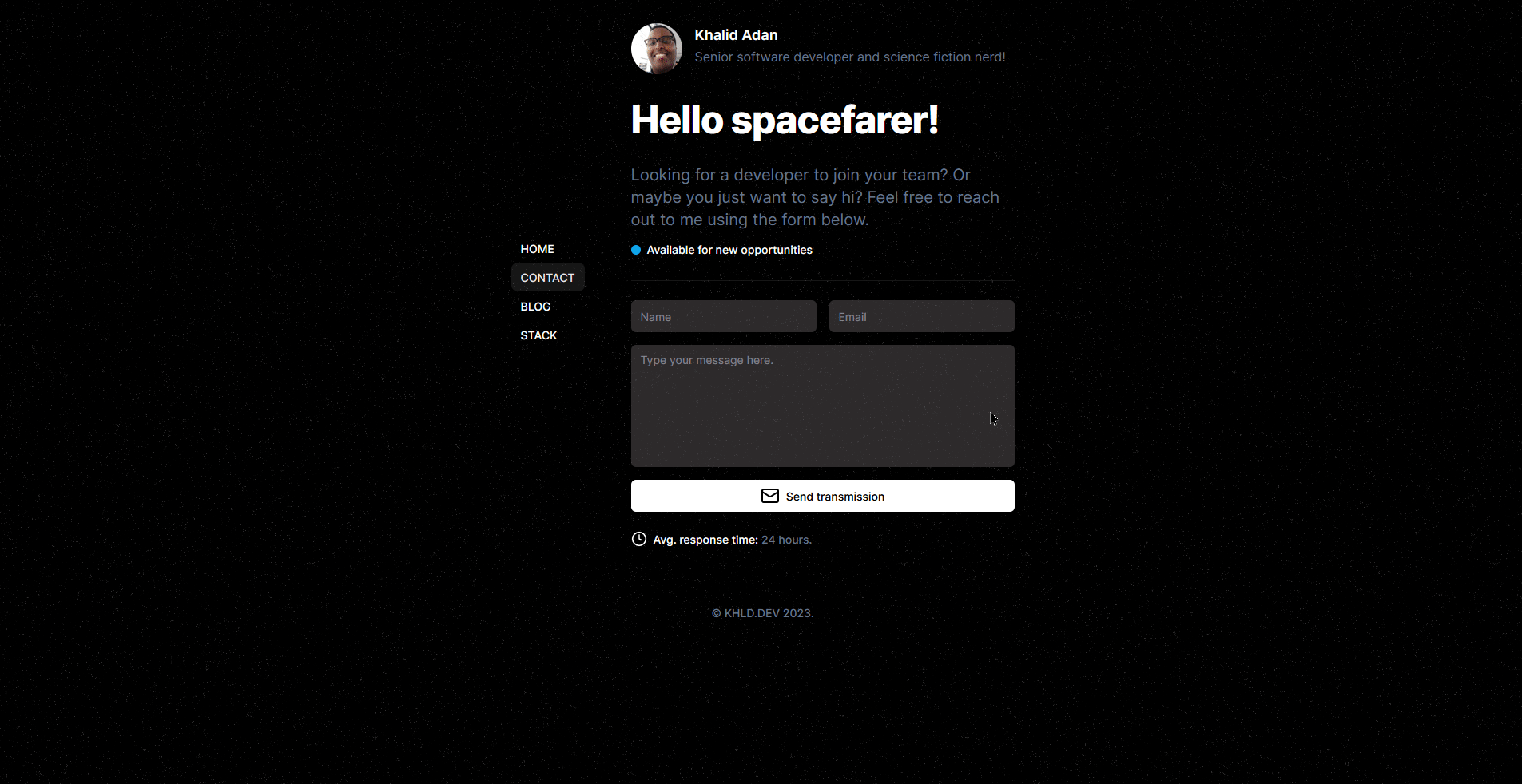 Check out the full effect here!
Performance and Accessibility considerations
While this technique is super cool, it does come with some caveats. The first is that it's not super performant. The SVG filter primitive is a pretty heavy operation, and so it's not something you want to be doing on a very serious app. I'd recommend using this technique sparingly, and only on pages where you can afford to have a bit of a performance hit like static blogs or personal sites.
Though it has no baring on accessibility in terms of screen readers, it does generate a decent amount of movement on the page and that might be unsettling for some users. In this case, I'd recommend adding a CSS rule that hides the effect for users who prefer reduced motion. You can do this in tailwind by adding the following classes to the SVG element:
className="h-0 motion-reduce:hidden pointer-events-none"
Browser support The browser support for this technique is pretty good.
All modern browsers seem to support it pretty well, with th3e exception being Safari where (quite oddly) the support is unknown, but in my very limited testing it seems to work fine.
Putting it all together
<svg
  xmlns="http://www.w3.org/2000/svg"
  version="1.1"
  xmlnsXlink="http://www.w3.org/1999/xlink"
  opacity="0.45"
  className="h-0 motion-reduce:hidden pointer-events-none"
>
  <defs>
    <filter id="space-filter">
      <feTurbulence
        type="fractalNoise"
        stitchTiles="stitch"
        result="turbulence"
        baseFrequency="{0.3}"
        numOctaves="{1}"
        seed="{0}"
      >
        <animate
          attributeName="baseFrequency"
          dur="60s"
          values="0.3;0.65"
          repeatCount="indefinite"
        />
      </feTurbulence>
      <feSpecularLighting
        surfaceScale="15"
        specularConstant="0.6"
        specularExponent="20"
        in="turbulence"
        result="specularLighting"
      >
        <feDistantLight azimuth="3" elevation="75"></feDistantLight>
      </feSpecularLighting>
    </filter>
  </defs>
</svg>
© KHLD.DEV 2025.